
Do you have a tough research question involving autosomal DNA? Do you like visualizing your data? Have you considered using a network graph to see connections between matches? Let me tell you how a network graph helped me break my Dyer brick wall and gave me new avenues for research.
Who were the parents of John Robert Dyer?
I have been searching for the parents of my husband’s 3rd great grandfather for the last several years. The ancestor in question, John Robert Dyer, is along the Dyer patrilineal line. I asked my husband’s father to take a Y-DNA test. None of the Y-DNA matches came back with the Dyer surname, or a close genetic distance, so it didn’t seem to help. We then asked my father-in-law to take an autosomal DNA test at Ancestry which I transferred to all the other databases. Here’s what I did with the results:
– Organized the 1st -3rd cousin matches in Ancestry into colored groups using the dots.
– Clustered the Ancestry matches with Genetic Affairs. The clustering timed out, probably because there were so many matches (my father-in-law has 98,000). There were several groups that had unidentified common ancestors, so it seemed a bit overwhelming to figure out which cluster to focus on.
– Searched the Ancestry matches’ trees with the Dyer surname in it and mapped out many possible connections with LucidChart.
– Analyzed traditional records in Hawkins, Tennessee, where he lived his whole adult life. The most promising lead we had was a family story written by John Robert Dyer’s granddaughter, who said John’s mother’s name was Sarah Taylor, but didn’t mention the father’s name. I had never found a person named Sarah (Taylor) Dyer who lived anywhere near John Robert Dyer or had any connection to him.
Network Graphs
I wasn’t getting many leads by looking for Dyers in Ancestry matches’ trees, so I asked my husband’s two uncles to take the AncestryDNA test as well, hoping this would shed more light on the case. About this time, I was making my research plan and learned more about the network graphs available at Connected DNA for multiple siblings. That same week, I received an email notification that the DNA results were ready for the third Dyer brother. Now that I had the DNA match profiles matches for three full siblings, I was excited to try a sibling network graph at Connected DNA! I hoped that visualizing all three brothers’ shared matches would give me a clue to the parents of John Robert Dyer.

Connected DNA Network Graph
When I got the network graph back just a few days after ordering it, I was amazed! I could clearly see connections between the clusters. Each dot is a DNA match. The larger the dot, the more DNA is shared with the tester. The lines between dots indicate that matches are related to each other.
The large pink cluster, group 12, includes matches I had previously identified as John Robert Dyer’s descendants, along with descendants of the parents his wife, Barsheba Tharp. The tan cluster, group 10, which is closely connected with group 12, has matches descending from the grandparents of Barsheba Tharp.
The most interesting cluster to me was the blue cluster at the top – group 3. After searching for the intersection of these matches’ family trees, I discovered that they descend from a group of Taylors and Daughertys who migrated from North Carolina to Warren County, Kentucky. One couple that stood out was Sarah Taylor and Robert Daugherty. I couldn’t believe it! I had found possible parents for John Robert Dyer. The network graph gave me the clue I needed. This clue went along with the only other clue I had found – the family story that Sarah Taylor was the name of John Robert Dyer’s mother.
Now I can do traditional research to learn more about this couple and determine if there is enough evidence to link John Robert Dyer to hypothesized mother, Sarah Taylor. Was Robert Daugherty his father? I’m not sure yet, but there are many possibilities to explore. Perhaps there John Robert Dyer’s mother is Sarah Taylor but his father is an unknown Dyer. Perhaps John Robert Dyer was apprenticed or adopted. In any case, I have work to do!
One thing I have noticed about Sarah Taylor and Robert Daugherty is that they seem to come from a group of Taylor descendants that intermarried. According to public member trees, they were first cousins. This could explain why the blue group is so large. There are many DNA matches in the group who are related to the my father-in-law in more than one way so they seem to be closer matches than they are.
Genetic Affairs
Let’s compare this to my Genetic Affairs Autocluster. Why couldn’t I find this answer with the AutoCluster?

Genetic Affairs AutoCluster
Groups 14-18 contain matches who descend from John Robert Dyer. Group 30 includes matches that descend from Sarah Taylor and Robert Daugherty. As you can see, there is no relationship between the two groups, like there is with the network graph. I will have to tweak the settings and try again to see how the clusters form differently. For this AutoCluster, thresholds of 60 cM and 12 cM were used. This included 10,200 matches and 42,595 shared matches, but after downloading the shared matches for 700 matches, the process ran out of time and stopped. Genetic Affairs says, “If this persists, we recommend employing other approaches that can for instance be executed on your local computer (which therefore don’t suffer from the time constraints we impose).” I will have to try that.
One of the main differences I notice between the AutoCluster and the Connected DNA Network Graphs is showing the relationships between the groups. The Connected DNA network graphs show the relationships between groups so clearly. I think that’s why the answer finally clicked for me when I analyzed the graph. It was exactly what I needed to make sense of the long lists of shared matches I had been working with.
I will try the Genetic Affairs AutoCluster again with the thresholds set at something like 250 cM and 20 cM, then I would expect to see the connection between the Dyer cluster and the Taylor/Daugherty cluster in the form of a supercluster with gray squares indicating a connection. You can see other superclusters in the AutoCluster where groups 14-18, for example, have many gray squares connection them in a larger cluster.
How to Read Network Graphs
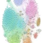
Each dot represents a DNA match and each line indicates a DNA connection between two matches. This means they are related to each other as well as to the test taker. The larger dots share more DNA with the test taker.
The groups that have the most connections between them are assigned a color and are considered a cluster that probably has a common ancestor. The connecting lines between clusters indicate that the common ancestors of those groups are probably closely related.
To see more example network graphs, go here: Example Connected DNA Network Graphs. This gallery includes 18 examples including a single profile AncestryDNA graph with over 1,300 fourth cousins or closer, a graph showing the matches of four siblings in one graph, and a single profile graph made with FamilyTreeDNA data.
About Connected DNA Network Graphs
Using the information from shared match lists at either Ancestry, FamilyTreeDNA, or 23andMe, Shelley Crawford creates network graphs for you to visualize clusters of matches who might share a common ancestor. On the home page of Connected DNA, she explains how her service came to be:
“The new world of DNA matches held so much promise but was difficult to navigate. When I realized that I could create network graphs of my DNA matches, new avenues of research opened up before me. I wanted to exchange ideas about network graphs with other genealogists, but no-one was talking about the technique. To share what I had learned, I posted a series of tutorials on how to create network charts on my personal blog [Twigs of Yore]. The response was positive and overwhelming. Yet not everyone has the time or inclination to create charts like these for themselves. This is where Connected DNA comes in.”
Network graphs can be created from a single person’s DNA matches, or a combined graph using the matches of several family members.
One of the things that sets network graphs apart from other cluster tools is the ability to see connections between clusters. This was a huge boon for me in the John Robert Dyer case.
You receive several files with your purchase:
-PDF network graph labelled with match names designed for onscreen viewing. You will need to zoom in to read the names. The PDF is searchable, a feature that I have used often.
-Image of the chart without names (as shown below)
-Group map showing the numbered labels (as shown below)
-Enhanced match spreadsheet (excel file)
Enhanced Match Spreadsheet
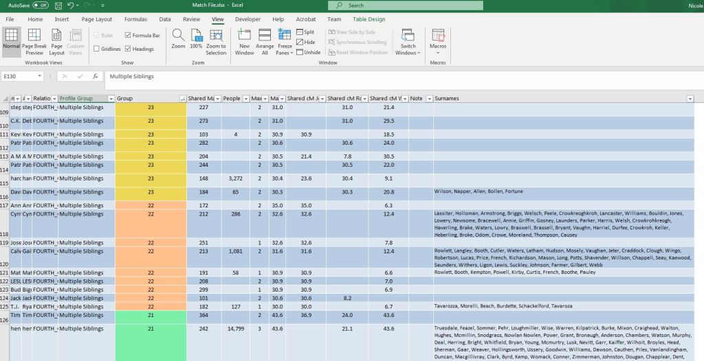
One of the best things about ordering a network graph from Connected DNA is the enhanced match spreadsheet that comes with it. The spreadsheet combines the original data with match group and in-common-with count information. From the Connected DNA home page, this is a list of the features of the enhanced spreadsheet:
-Hyperlinks to Ancestry match pages for every DNA match allow you to jump directly from the spreadsheet to the match page.
-Groups membership is labelled and colored to match the graph.
-Shared match counts have been added. For those with few close matches these are invaluable for identifying the distant matches most likely to be relevant to your research.
-Friendly symbols – see at a glance which matches you have ‘starred’, have shared ancestor hints, or have trees linked to their DNA results.
-Surname list for each match with a public tree connected to their DNA (Ancestors file required).
-Formatting to make searching, sorting and filtering easier.
I began working from my spreadsheet right away to identify possible common ancestors for each cluster. It’s easy to sort the spreadsheet by group and begin to notice patterns of surnames within that group. One of my favorite features is being able to click on the shared cM link and be taken straight to the AncestryDNA match page. Another great feature is that the notes field from AncestryDNA is included. Any matches who I had added notes for were preserved. I had included the MRCA for matches within several of the groups, which was a huge hint to who the MRCA for the cluster could be.
Downloading Matches with DNAGedcom
Before you can order the Connected DNA network graph, you will need to download your matches using the DNAGedcom client. If you don’t want to do this, you can add this on as an option in your Connected DNA purchase and Shelley will download them for you. You just need to share you AncestryDNA results with her as a “viewer.”
If you do decide to download your own matches, here’s what you need to know. DNAGedcom is a third party DNA analysis tool. You will need to subscribe to DNA Gedcom for $10 a month (which can be cancelled after the first month) and download the program called “DNA Gedcom Client.” You will use that program to download the DNA matches for the kits they manage from Ancestry, FamilyTree DNA, 23andMe, GEDmatch Genesis, and MyHeritage. Doing this creates a CSV file with a listing of all the DNA matches for that kit/profile.
When you are downloading matches for a profile, you have the option to also download the “in-common-with” and “tree” CSV files. Be sure to check the box next to “in-common-with.” For the Connected DNA network graphs, you are required to submit the match file and the in-common-with CSV files generated by DNAGedcom. If you also check the box next to the trees and generate that file, Connected DNA will add the surnames from matches with public trees to your enhanced match spreadsheet.
Connected DNA shares these tips for downloading the match data yourself:
“The DNAGedcom client is a small piece of software that can be used to download the data files for a modest subscription cost that can be cancelled at any time. Please leave “Quicker Match Gather” unchecked for best results. I recommend using a minimum cM value of 20cM if you have more than 1,000 estimated 4th or closer cousins, 15cM if more than 500, or 10cM if less than 500. Tree files can optionally be provided if you would like surnames appended to each match (no extra cost). An upload link for the files will be provided in your order confirmation email.”
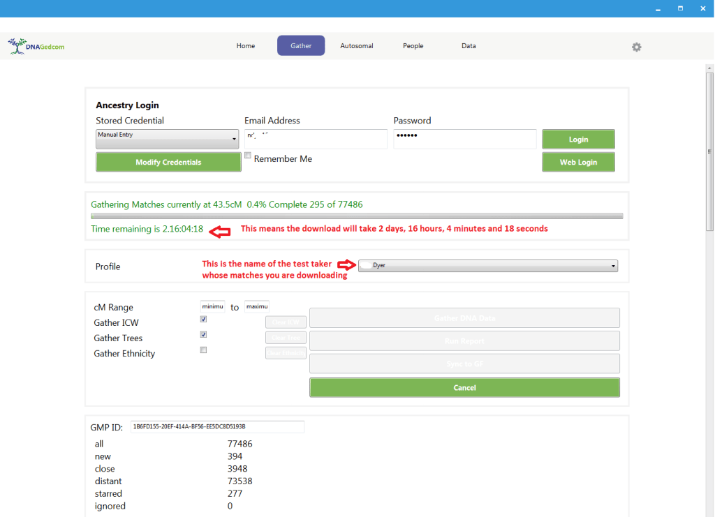
Downloading matches from Ancestry takes a long time. Ancestry DNA has the largest database of testers and chances are you have between 40,000-100,000 matches. This particular profile, shown in the DNAGedcom Client screenshot above, has 77,486 matches. The time that it takes to download that many matches is about 2-3 days. I’ve downloaded matches from four other Ancestry profiles and it really does take 2-3 days. FamilyTreeDNA was faster, probably because there were less matches.

In the screenshot above, the gathering is about 50% complete. I think it’s interesting that over half the matches are under 8.6 cM. You can certainly set a minimum threshold to speed up the process! If you adjust the matches to only download those above 10 or 15 cM, you will significantly decrease the amount of time it takes to download the matches. Most of the matches are smaller than 15 cM. It only takes a couple hours to download all the matches over 15 cM.
To make sure the program continues to download and not stop when your computer goes to sleep, change your computer’s sleep settings or play music on repeat (and muted) to keep the computer from sleeping. I haven’t tried downloading from MyHeritage, but I’ve heard that takes much longer than Ancestry – weeks instead of days.

When you download the match, in-common-with, and tree files on Ancestry, the files will be located on your computer in the directory set the first time you started the program. The match file will be named m_firstname_surname.csv, the in-common-with file will be named icw_firstname_surname.csv, and the tree file will be named a__firstname_surname.csv (a stands for ancestors). These are the files you provide to Connected DNA for your network graph and enhanced match spreadsheet.
Endogamy and Network Graphs
A few participants in our Research Like a Pro with DNA Study Group ordered a network graph. Two of them had concerns about endogamy in their family making the graphs less useful. The network graph that included ancestral intermarriage in North Carolina turned out fine and the customer was excited about it.

Network Graph Image of North Carolina intermarriage case
The graph with Italian endogamy didn’t help with the research question as much as was hoped, and the customer was disappointed. See the screenshot of the zoomed out network graph below showing endogamy in two Italian towns.

Screenshot of Network Graph PDF showing Italian endogamy
The network graph identified two distinct groups that show the endogamy in the two areas of Italy where the tester’s ancestors were from; on the left, ancestors Buccino, Italy. On the right, ancestors from Molinara and San Giorgio la Molara, Italy.
When people in the same region marry cousins and become related in several different ways, it’s difficult to separate matches into smaller, distinct genetic networks. They end up being lumped together in one big cluster.
Network Graph Options
*Updated April 2022 – ConnectedDNA is not taking orders at this time.
Shelley offers multiple types of graphs, depending on how many DNA profiles you want to use. You may have tested both your father and his brother, and combining their results into one network graph could reveal more matches than just one. In this case, you would want to order the Siblings Graph. The prices are in Australian Dollars, so in U.S. dollars the cost will be about 30% less. To see the exchange rate with U.S. Dollars, click here.
Single profile graph (AncestryDNA) A$55.00 – one person
Siblings graph (Ancestry DNA) A$70.00 – any number of full siblings
Close family graph (Ancestry DNA) A$80.00 – 1-6 close relatives, including siblings, grandparents, half-siblings, aunt/uncles, first cousins
Extended family graph (Ancestry DNA) A$120.00 – a single person or any number of full-siblings plus one maternal grandparent and two paternal aunts, a set of second cousin full-siblings, maternal and paternal half-siblings, father and maternal half-sibling, or other combinations. Contact Shelley before ordering to confirm that the combination and number of profiles you have in mind is feasible.
The same types of graphs are also available for Family Tree DNA profiles. There are not options for MyHeritage or LivingDNA.
DNA match clustering and network graph (23andMe data) A$65.00 – one profile or the addition of full siblings for A$15
Coupon Code
Remember to use our coupon code, FamilyLocket15, to get 15% off your Connected DNA order. This code is good until the end of February 2020. I am not an affiliate, I just love Connected DNA network graphs!
Learn to Make Your Own Network Graphs
To learn how to make network graphs on your own, you will find Shelley’s blog posts at Twigs of Yore very helpful! She has laid out the process in a step-by-step way that is very accessible. I’m learning how to do it right now and downloaded NodeXL. Check out the posts here: Visualising Ancestry DNA matches–Index at Twigs of Yore.
Update 2022: You can also learn how to make network graphs with Gephi in our Research Like a Pro with DNA online course. Some of the recorded office hours sessions teach you how to download your DNA matches with DNAGedcom Client and use Gephi to produce a network graph. To register, go here: Research Like a Pro with DNA eCourse
Save to Pinterest




Leave a Reply
Thanks for the note!