Would you like an efficient method to find clusters of DNA matches relevant to your research subject? In this series, I’m sharing the steps to create a network graph using the free, open source Gephi application, available for Windows or Mac. I use Gephi to create network graphs of my AncestryDNA matches, but you can use matches from other companies as well. Throughout this series, I will be using my own matches from AncestryDNA, but I have changed their names for privacy. Below are the previous steps in this tutorial:
Creating Gephi Network Graphs Part 1: Gather Matches and Prepare Spreadsheets
Creating Network Graphs with Gephi Part 2: Import Spreadsheets and Run Layouts
This article goes over how to adjust your network graph, including deleting unconnected nodes, removing close matches, running modularity to find communities, adding colors to communities, changing the node size, and configuring labels.
Tour of the Visualization Window (Graph)
The network graph you are creating is viewed in the Gephi visualization window. This window has several toolbars within it, which are labeled in the image above. To learn more about what the function of each item, see the Gephi Visualization Tutorial here: https://gephi.org/tutorials/gephi-tutorial-visualization.pdf.
One of my most often used tool is the “center on graph” tool in the reset tools area – it’s the magnifying glass icon. When you zoom in to the graph, and you want to zoom back out to see the whole graph again, click the center on graph magnifying glass button.
Delete Unconnected Nodes
In the previous post in this series, we imported the match file. Sometimes, after you import the matches, you will notice that several DNA matches are unconnected to any of the other nodes in the graph. This means they don’t have any shared matches with people in your selected range of shared DNA. For my example, I’m using a range of matches from 50-400 cM. In that range, I didn’t have any unconnected nodes. For this step, I’ll share a screenshot from a different network graph.
The gold circle above is showing several unconnected nodes in the center of the graph after importing the match file. In order to isolate the unconnected nodes, I used the topology filter. Here’s how to do it:
Go to the filters panel on the right. Double-click topology. This opens a list of filters that have to do with the topology of the network graph (topology means the way constituent parts are arranged).
After you double-click the topology category, a list of filters will be listed below it. The one we want is “degree range.” Degree range refers to how many connecting lines a node has. Double-click degree range to add it to the queries section below the list of filters.
Next, click the plus below degree range, and click “parameters.”
Change the upper end by clicking the number and changing it to 0 (type 0 and hit Enter). Click the Filter button. Now you should see just the nodes that have no connections. (Connections means edges/lines connecting nodes).
Next, go to the selection tools and choose the rectangle selection tool. This allows you to select multiple nodes.
Click and drag to select all the nodes. Then, right click on one of the selected nodes and click delete. A pop-up box will say, “Nodes will be deleted. Do you want to proceed?” Click yes.
Now that you’ve deleted the unconnected nodes, you can click “stop” on the filter. You can also right click on the degree range filter and click “remove.”
Remove Close Matches or Adjust Range
If the range of matches you’re using includes closer matches, like siblings, parents, and so forth, this could make your graph difficult to read. Close matches will be connected to many others in your graph. You may want to remove close matches to reduce extra edges/lines. This can be done with the range filter.
In the filters library, click the plus button for attributes, then range. From there, double-click “sharedcm” to add it to the queries section below.
In the Range (sharedcm) filter, click the plus, then click parameters. Below that, you will see the Range (sharedcM) Settings. Click on the numbers to type a new range, i.e. 1300-3500cM, then click filter. Use the rectangle select tool to select all the close matches, right click, and then choose delete.
Additional ways to use the range feature include:
- Reduce noise by filtering out smaller matches. If you import all your matches down to 8 cM into the network graph, you will have many random connections between all the clusters from people sharing DNA along different lines than the ones you share with them. This can cause a lot of noise and messiness in the graph. You may want to use the range filter to remove matches from 8-15 cM.
- Help sub-clusters separate by removing closer matches. Closer cousins like first and second cousins are connected to several clusters along the shared grandparent and great-grandparent MRCA’s line. Sometimes this causes two or three clusters to stay lumped together in one big cluster. If you remove those closer cousins, those smaller sub-clusters can often separate out into their own groupings.
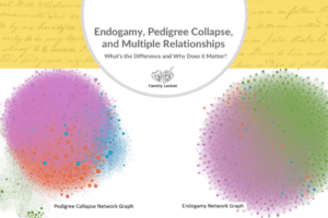
- Those with pedigree collapse or endogamy may want to experiment with setting the lower limit to higher levels like 30cM, 50 cM, 70 cM, etc. to see what works best. Test takers who come from the same endogamous community on all their family lines will not likely derive much benefit from a network graph. See our article Endogamy, Pedigree Collapse, and Multiple Relationships: What’s the Difference and Why Does it Matter?.
After you remove matches that you don’t want to use in your graph, press the stop button on the range filter settings in the bottom right. You can leave the filter there to use again later, or you can remove it by right-clicking on it and clicking remove.
Run Modularity to Find Communities
Modularity is a measure of the strength of the network graph’s division into clusters. High modularity means there are dense connections between nodes in the same cluster and few connections to nodes in different clusters. Gephi uses the Louvain method for modularity. This method is used uncover communities in large networks (millions of nodes) quickly.
In your network graph, you can probably see some clusters, but a few nodes may appear to be caught in between two clusters. Also, some clusters may appear to have sub-clusters within them. Running the modularity algorithm assigns each node to a cluster and gives each cluster a number.
To run the modularity algorithm, go to the statistics panel on the right. Then, in the Network Overview section, find modularity. Click the run button next to modularity.
In the pop-up box that appears, don’t change the settings, and click ok. Later, you might want to experiment with changing the resolution. As the pop-up box says, lower resolutions give you more communities and higher resolutions give you less communities (bigger ones). I usually stick with a resolution of 1.0, but you can go down to 0.5 or 0.25 to get more clusters/communities. You can also try going up to a 20.0 resolution to see your graph divided into 2-3 clusters, possibly breaking it down into paternal and maternal clusters.
The Modularity Report then gives you a score of modularity for your graph. The results for my 50-400cM graph were 6 communities with modularity of 0.638.
Add Colors to the Communities
Now that the clusters are defined and have a number, you can sort by modularity class in the data laboratory, view each node’s cluster number as a label, but most importantly, you can color each cluster. This is one of my favorite parts of the network graph! I love seeing colorful groupings.
To add color, go the Appearance panel at the top left of Gephi. On the nodes tab, the paint palette icon should already be selected.
Click the partition tab and in the “choose an attribute” dropdown list, select “Modularity Class.”
Click palette, then click generate, and then uncheck the option to “limit the number of colors.”
Choose a color scheme with the presets dropdown box. The default is a good option. Another good one to start with is “fancy (light background).” Click ok.
To add these colors to the clusters, click the apply button at the bottom of the Appearance panel.
Change Node Size
Next, you can change the node size to show the difference between large and small matches. To do this, go to the appearance panel again, and select the nodes tab.
Select the ranking tab, and select the node size icon (instead of paint palette). In the dropdown list “choose an attribute,” select “shared cM.” Next, enter a minimum and maximum size. To start, you can try a min size of 20 cM and a max size of 100 cM, but then you could adjust that based on how it looks. Click apply, then adjust again if you don’t like how it turned out.
 Now we can see which matches share more DNA!
Configure Labels
To turn on labels, click the arrow “more settings” tool at the bottom right of the graph visualization window. Click the labels tab, then check the box next to Node. Then click the “configure” button. Usually I like to see the name and the modularity class, so uncheck label and check name and modularity class, then click ok. If the labels are too big or small, you can adjust the font size with the slider bar.
You can experiment with showing different things for the labels, like notes. If you’ve added the ancestral couple for your match notes, that could make it easier to identify the MRCA couple or line for each cluster.
Configure Edges
You can change the thickness/darkness of the connecting lines (technically called edges). There’s a slider bar next to a T at the bottom of the visualization window for adjusting the thickness of edges. You can also find this slider bar under the more settings down arrow at the bottom left of the visualization window, in the Edges tab. The slider bar in that tab is labelled “scale.” You can also choose if you want to show the edges, use a different color for edges, or use the node’s color for the edge color.
Next – Go to Part 4
Part four of this series is about the preview and data laboratory tabs and saving/exporting the graph and data. To go to that post, click here: Creating Gephi Network Graphs Part 4: Exporting and Saving the Graph.


7 Comments
Leave your reply.