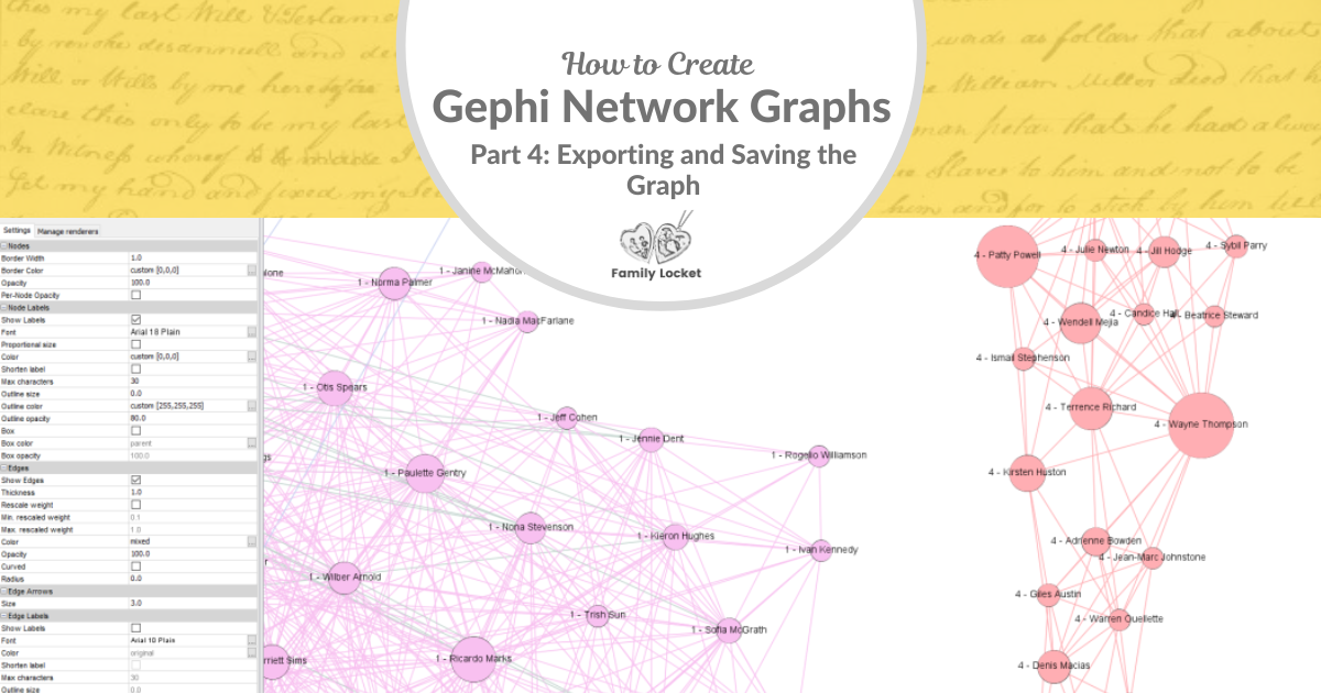
Would you like an efficient method to find clusters of DNA matches relevant to your research subject? In this series, I’m sharing the steps to create a network graph using the free, open source Gephi application, available for Windows or Mac. I use Gephi to create network graphs of my AncestryDNA matches. Throughout this series, I will be using my own matches from AncestryDNA, but I have changed their names for privacy. Below are the previous steps in this tutorial:
Creating Gephi Network Graphs Part 1: Gather Matches and Prepare Spreadsheets
Creating Network Graphs with Gephi Part 2: Import Spreadsheets and Run Layouts
Creating Gephi Network Graphs Part 3: Adjusting the Network Graph
Now that you have followed the tutorials in parts 1-3, you have a network graph. Now you may want to export it as a PDF, PNG, or SVG file. First, you’ll need to set up labels in the data laboratory if you want the nodes to be labelled in exported graph.
Configure Labels in the Data Laboratory
Go to the Data Laboratory tab at the top. You will see that the label column is empty. You may also see several other columns that are empty. Since you are only allowed to have a certain number of columns in Gephi, you may want to uncheck some of the visible columns that you’re not using. You can change which columns are visible in the Data Laboratory by clicking on the lightbulb in the top right. I like to turn on the modularity class column, so I can see which cluster number each person is in. You can sort by this column if you click on the column header.
Note: The names of DNA matches in my example screenshots have been privatized using a random name generator.
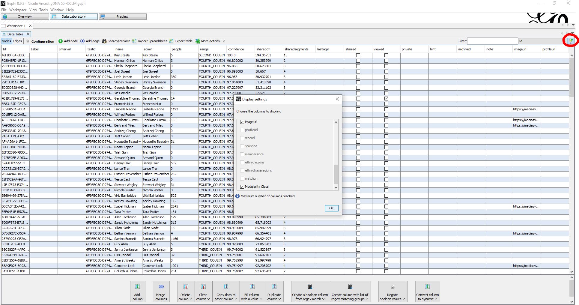
In order to create a label for the nodes when you export a PDF graph, you need to uncheck enough of the columns so that you have the ability to create a new column. In the image above, I clicked on the lightbulb and saw that I had the maximum number of columns. So, I unchecked a bunch of columns I didn’t need.
Now we will create a new column that will describe each node by their modularity class and name. To do this, click “Merge Columns” at the bottom. From the list of available columns on the left, select modularity class. It will be at the bottom. Then use the arrow pointing to the right to add it to your list of columns to merge. Then, do the same for the name column. In the dropdown for merge strategy, make sure it says “join values with separator.”

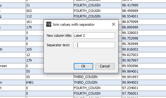
Next, give your new column a title – I usually use label 2. Then choose what symbol you’d like to use to separate the text – I usually use a space, dash, and space.
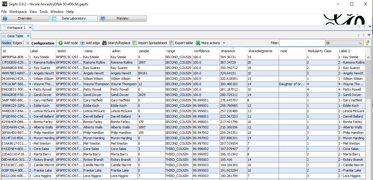
Click Ok. Now you will see a new column titled “Label 2” appear on the right side of the data laboratory. Next, you will click the button at the bottom “Copy data to other column.” When you click this, you will see a list of the columns. Choose Label 2. Then you will see a dialog box asking you to copy data from Label 2 and which column you’d like to copy it to. Choose the Label column, and click Ok. Now you have a label for your nodes, and you are ready to export the graph as a PNG or PDF file.
Export an SVG, PNG, or PDF
Next, go to the Preview Tab at the top. When you first go there, you will see a blank preview window.
![]()
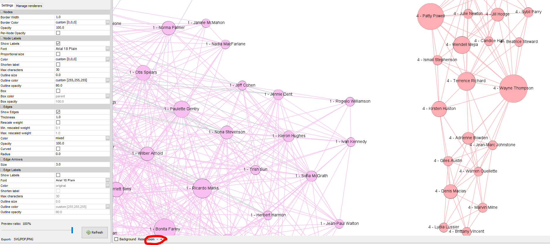
On the left, you’ll see a window called “Preview Settings.” Go to the section for the Node Labels, and check the box that says “show labels.” Then uncheck the box that says “proportional size.” I prefer to have all the labels be small in size.
The Edges settings are below the node label settings. Make sure the box next to “show edges” is checked. I prefer to use straight lines, so I uncheck the box next to curved.
Once you’ve set up these settings, click the Refresh button at the bottom.

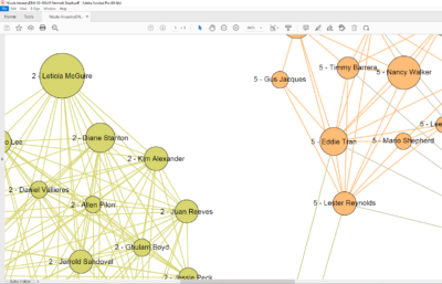
If you want to change the size of the font for the node labels, you can do that now. Go to the Node Labels area and click on the 3 dots next to Font – which is currently set to Arial 12 Plain for my example above. This opens a window to select a new font, font style (bold, italic, etc.), and size. I usually make the size larger than 12, about 18 seems to work well. When you export a PDF, you can view the PDF with Adobe Acrobat Reader, which is free and allows you to zoom in to 6400% to see the tiny labels. After choosing your text size, click Ok, and then click Refresh again at the bottom. You can use your mouse wheel to zoom in and see what the text looks like, or click the zoom buttons at the bottom.
 When you have the labels looking the way you want them, you can export the file as an SVG, PNG, or PDF. I usually export the graph as a PDF and then I or whoever I’m sharing the graph with can use a PDF reader like Adobe Acrobat to view the graph, and zoom way in to read labels. To do this, simply click the button at the bottom left that says “Export: SVG/PDF/PNG.” When you do that, a file explorer window opens and you can select where on your computer file system you would like to save the PDF file.
First, change the file type to be PDF in the “Files of type” dropdown list. The other options are PNG or SVG, both types of image files. Then, type a name for your file. I usually use the same name I gave the Gephi file – Nicole AncestryDNA 50-400cM Network Graph.pdf.
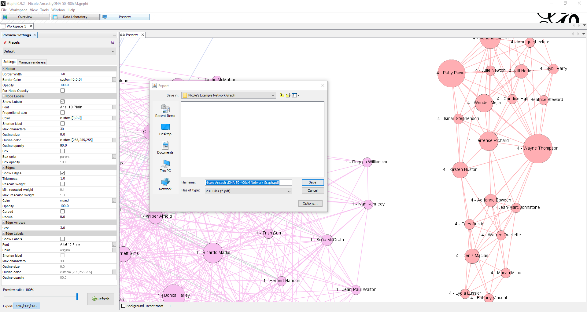
Click save and then you’re done! You can go to the file folder where you chose to save it, and open your new PDF file.
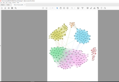
Here’s what it looks like when I view it in Adobe Acrobat zoomed out, and zoomed in close.
Export the Data Laboratory to a CSV
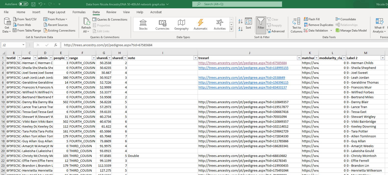
Now that you have a visual image of the network graph, you will probably want to have a spreadsheet with the data. You can export the data from the data laboratory to a CSV file that you can then open with Excel or a similar program. Go back to the data laboratory and click “export table” at the top.
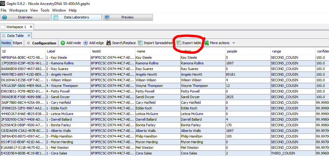
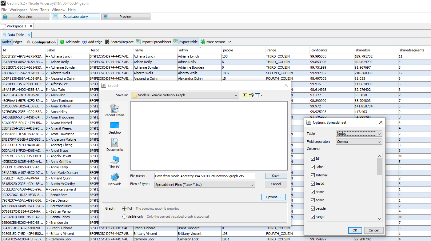
Clicking export table opens a file window so you can designate where you would like to save your spreadsheet file. At the bottom, you can tell Gephi if you want to export the complete graph, or just the visible portion of the graph. At this time, I recommend exporting the full graph, but in a future post, we will talk about how to narrow down your graph.
Give your spreadsheet file a name. I usually use something like: Data from Nicole AncestryDNA 50-400cM network graph.csv. If you click the options button, you can uncheck any columns that you don’t want to export. I usually just delete unwanted columns in the spreadsheet though. In the options, make sure you have the Nodes table selected. If you export the Edges table instead, it won’t be helpful.
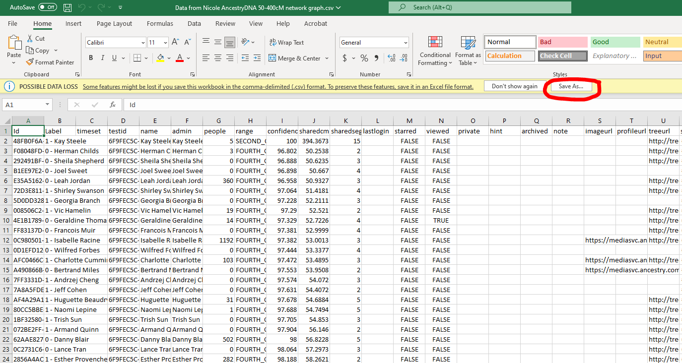
Now you can open the spreadsheet file with Excel and sort, filter, group, and make notes about your matches. Before you can do that, you’ll have to open the file with Excel and save it as an .xlsx file instead of .csv. Just click the “Save As” button along the yellow strip. In the file window that opens, change the dropdown box for file type to “Excel Workbook” xlsx file type.
Often I use this spreadsheet to help me figure out the common ancestral couple of the cluster. First, I sort by modularity class. Then I click on the links to trees of matches in the cluster with many people in their trees. Then, I put my conclusion for the MRCA with that match into the note column. Once I have several MRCAs for that cluster that seem to agree about which family line they represent, I move on to another cluster. If I can’t figure out any common ancestors, I know that’s a cluster of unknown matches that could help me learn who a missing ancestor is, or matches whose common ancestor is really far back and may not found.
To set up your Excel File to help you do this, delete any column that’s not helpful to you. I remove most of them except testid, name, admin, people, range, shraedcm, sharedsegments, note, treeurl, matchurl, and modularity class. Then, go to the Data tab. Select the first row, which contains all the column headers. Then click the funnel icon that says Filter.
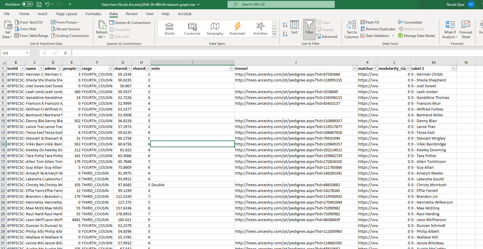
Now you have dropdown arrows for each column header. You can sort by modularity class first, to get all the people in the same clusters grouped together. After that, you may want to sort by sharedcm or people. The people column refers to the number of people in that person’s attached tree.
The URLs in the spreadsheet are not hotlinks. However you can quickly turn them into hotlinks by double-clicking on the cell, and then clicking on a different cell. Now you can click the hotlinks and the page with that DNA match’s tree will open.
This is an exciting part of the analysis of your network graph – you get to look at many trees of DNA matches in the same cluster, who are shared matches with each other, and see if you can find common ancestors!
Export a GraphML File
You may have already noticed that Gephi program files are saved with the file extension .gephi. This is a file type that can only be opened with Gephi. However, if you want to open your network graph with another software tool, you can export the graph file in the following additional file formats. The links below tell you more about the formats, and I have brought in some quotes about them.
GDF – “the file format used by GUESS. It is built like a database table or a coma separated file (CSV). It supports attributes to both nodes and edges.”
GEXF – “(Graph Exchange XML Format) is a language for describing complex networks structures, their associated data and dynamics.”
GraphML – “a comprehensive and easy-to-use file format for graphs. It consists of a language core to describe the structural properties of a graph and a flexible extension mechanism to add application-specific data.”
Pajek NET – “This format uses NET extension and is easy to use. Attributes support is however missing, only the network topology can be represented with a Pajek File.”
You may have tried making a network graph before with Shelley Crawford’s tutorial using the tool NodeXL. The GraphML file is able to be opened with NodeXL (as stated in the Gephi site here).
Another reason to export a graph as a GraphML file is if you have filtered out matches to focus on a subset of clusters (which we will talk about in the next post), and you want to save the graph of just visible nodes and edges. If you try to save this subset as a Gephi file, when you open the project again you will not see just the clusters you chose. It will bring you back to the entire network graph. However, exporting the current visualization as a GraphML file will bring you back to the exact format you left off with.
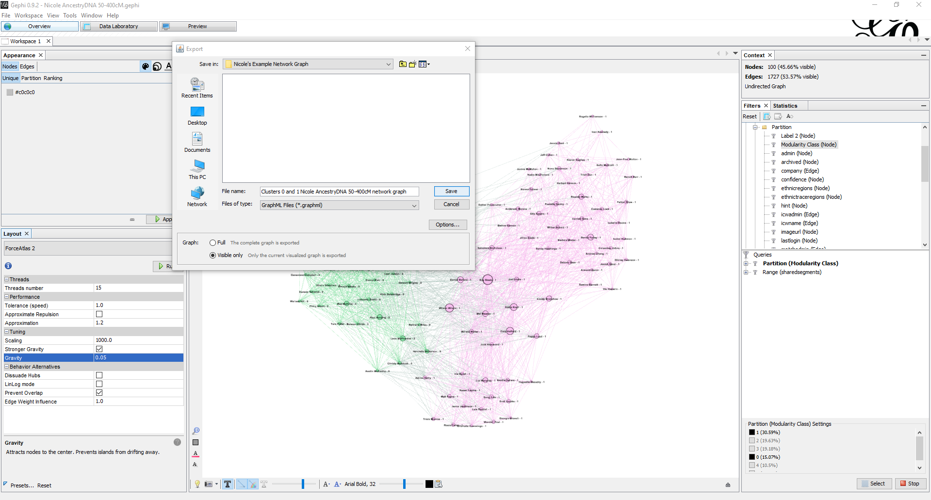
Exporting the graph as a GraphML file or another file type is easy. Just click File > Export > Graph File. Then a file window will open. Choose which graph file type from the “files of type” dropdown list. We will use GraphML as our example. After choosing the GraphML file type, give your exported graph a file name. At the bottom, you can choose to export the full graph, or you can export only the visible portions of the graph.
In the image below, I have filtered out all other clusters except 0 and 1. I ran Force Atlas again with a much lower gravity – 0.05, in order to get the groupings to separate a bit more. I want to export this as a GraphML with the “visible only” option. This way I can see this graph again without having to narrow down the clusters and run the layout again. I gave it a new name – “Clusters 0 and 1 Nicole AncesryDNA50-400 cM network graph.graph.”
Now, when I want to continue this project where I left off, I can open Gephi, click File > Open, and select this GraphML file. Gephi will generate this import report:
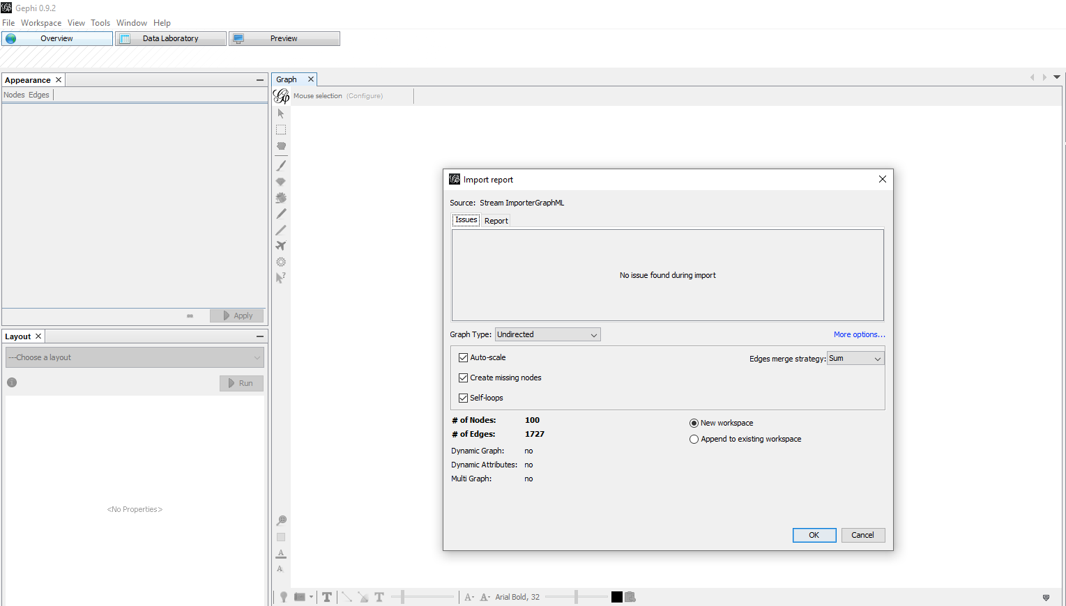
Click Ok and then you are ready to continue where you left off!
Next: Go to Part 5
Part five of this series will be about focusing and analyzing the network graph by filtering out irrelevant clusters, comparing two clusters to each other, finding clusters that are connected to each other, random connections, and so forth.
Creating Network Graphs with Gephi Part 5: Analyze the Network Graph


11 Comments
Leave your reply.